The Inferior Iron Man joins the Inferior Spider-Man.
I don't know what is it with the 'Superior' characters and Iron Man figures, but it seems like Hasbro just loves
dropping the ball with them. Much like Midnight Sons Iron Man, this
Superior Iron Man is just
lazy. And it sucks, because I thought the idea behind Superior Iron Man was son interesting, so I actually read the comics, and I've been looking forward to this figure for a while now...
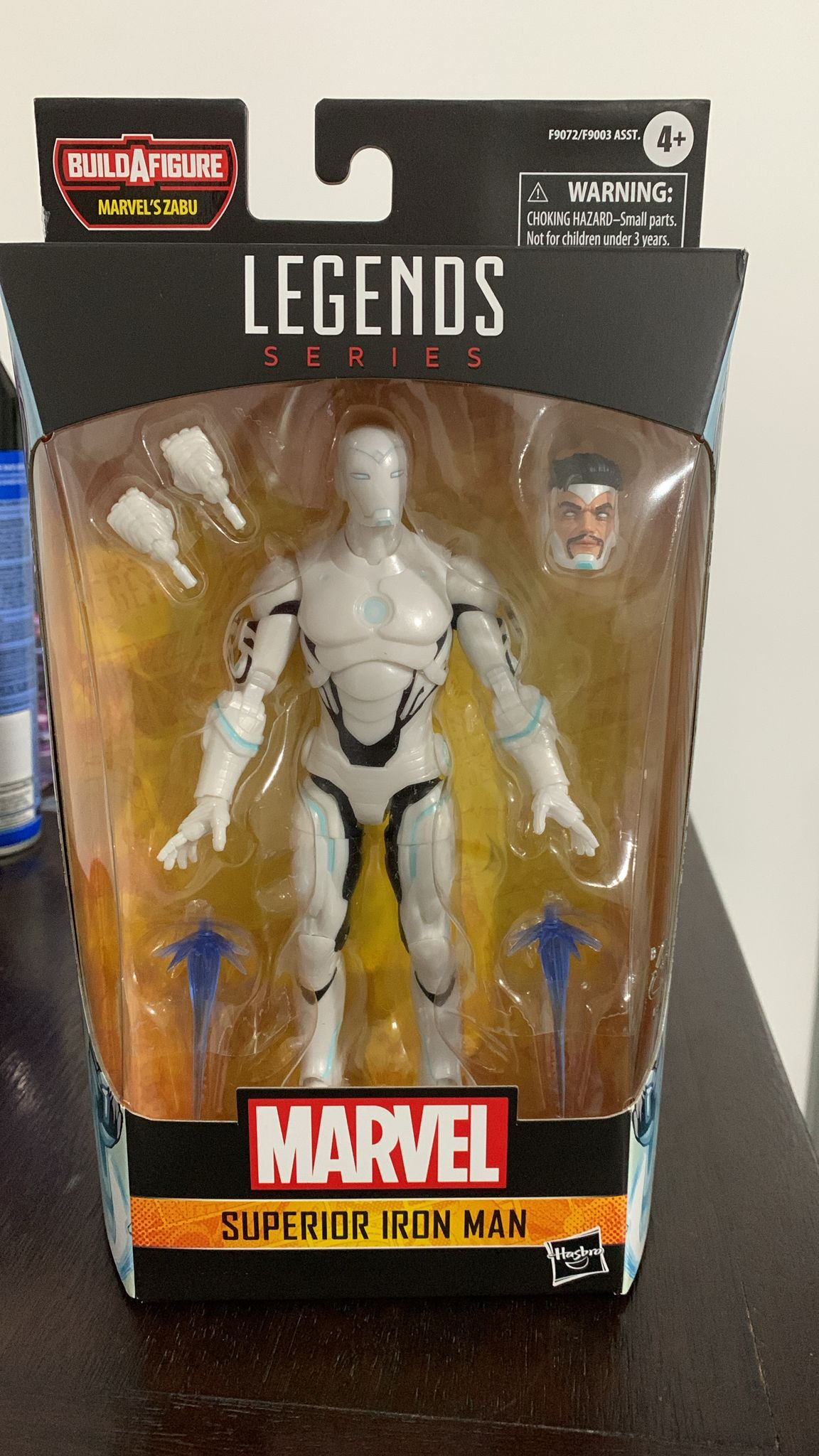
And well... for starters, I didn't care too much, but a lot of people were
annoyed at the pearly white paint they went for him instead of Silver. I didn't mind, depending on the colorist, it could look white, so I really don't mind it... but the black? C'mon, the black parts of the costume DO NOT look like this. The rest of the sculpt is SO good, even the torso is right, but they couldn't get the black paint right?
C'mon now. On a more positive note, the alternate head sculpt looks so
devious, I love it. I will have him around with the helmet on, but the Tony Stark head is perfect. He comes with a pair of alternate fist hands and two energy effects for his feet or hands...
The articulation covers all the Marvel Legends basics, but he has no waist swivel, just a ball-jointed torso that has great range to the sides... but not a lot of ab-crunch forwards or backwards, which kinda sucks. He is a
bit taller than Bucky Cap.
As seen here, the energy effects don't fit very well on his hands, the sockets aren't deep enough, so they fall down
pretty easily. Kinda disappointing, haven't had this happen with any other Iron Man figure, not even the Midnight Sons one.
And look at this, even the back of the box shows you how the black paint should go on his abdomen and sides, but it looks
NOTHING like this, and I don't know why they did it this way. They sculpted all the other details on his armor right, but they
couldn't get the paint right? Was the black paint too expensive? I don't know.
This is as forwards as the ab crunch goes...
And this is as far back as it can go. Not very good, if you ask me.
Another botched Iron Man figure. Look, in a vacuum, this is a decent action figure, even despite the mediocre ab crunch, but,
BUT, how could they get the paint scheme
so wrong? Some people have been posting photos of their customized Superior Iron Men, painting it right, and it looks incredible, so why did Hasbro fumble the bag so badly?


No comments:
Post a Comment